


Healthcare products are not judged by how they look – they are judged by how easily people can get care through them. When a patient struggles to book an appointment or access a report, design becomes a barrier. When the journey feels effortless, design becomes part of the care itself.
This is where healthcare UI/UX design moves from being a visual layer to a functional advantage. The platforms that win are the ones that reduce friction at every step – before, during, and after care.
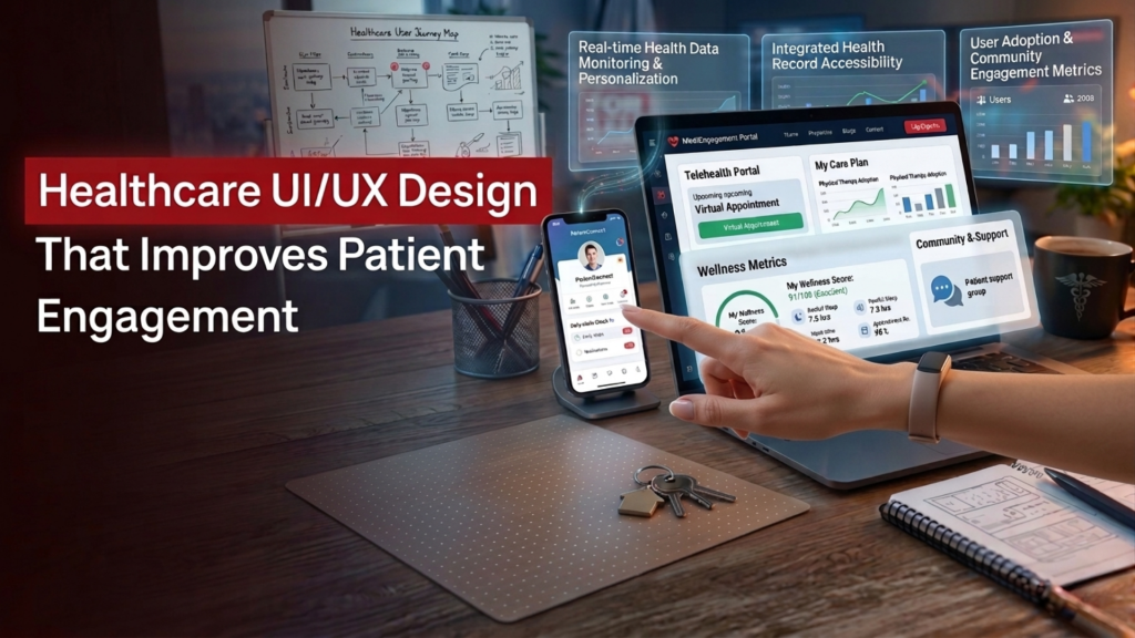
In this blog, we will explore the design decisions that directly impact patient behavior, engagement, and long-term platform adoption.
Design Around Patient Intent
Most healthcare platforms are still structured around internal workflows rather than patient needs. That disconnect is where drop-offs begin. Patients typically arrive with a clear intent:
- “I need to consult a doctor”
- “I want to check my report”
- “I need to reschedule something quickly”
A strong patient portal UI prioritizes these intents instead of forcing users to navigate system-heavy menus.
What works better?
- Action-first dashboards (Book, Consult, View Reports)
- Minimal steps to complete a task
- Clear progress indicators for multi-step actions
When interfaces reflect real behavior, engagement improves.
Remove Friction from Telehealth Experiences
Virtual care only works when it feels simpler than visiting a clinic. If users have to figure things out, they disengage. A well-executed telemedicine app design focuses on clarity and flow – not features.
Key design principles
- One-click join for appointments
- Pre-visit device checks (camera, mic, internet)
- Visible next steps after consultation
- Clear fallback options if something fails
Patients are more likely to return when the experience feels predictable. Around 60% of users report higher satisfaction with telehealth compared to traditional visits when the digital journey is seamless.
Make Trust Visible – Not Complicated
Healthcare platforms deal with sensitive data, but trust is not built through complexity – it is built through clarity. In medical software UX, security should feel natural, not overwhelming. Users should feel protected without being slowed down.
How to design for trust?
- Simple, readable consent flows
- Transparent data usage explanations
- Clean authentication experiences (OTP, biometrics)
- Clear session and logout visibility
A well-balanced HIPAA-compliant design ensures safety without adding cognitive load. When users understand what is happening with their data, they are more likely to continue using the platform.
Build for Real-World Use – Not Ideal Scenarios
Healthcare usage is rarely linear. Patients switch devices, involve caregivers, and revisit information multiple times. Effective healthcare interface design accounts for this reality.
Practical considerations
- Mobile-first layouts (most users access via phones)
- Support for caregiver or family access
- Easy-to-read typography for all age groups
- Multilingual options where relevant
- Resume actions (continue where you left off)
Caregiver involvement is growing rapidly, with over 50% of users now accessing patient portals on behalf of someone else. Ignoring this behavior leads to incomplete experiences and lower adoption.
Simplify Information Without Losing Meaning
Medical data is complex, but the interface does not have to be. Patients do not think in clinical terminology. They think in outcomes and clarity.
Better content design
- Replace jargon with plain language
- Use visual hierarchy for reports (highlights first, details later)
- Add contextual explanations (“What this means” sections)
- Use progressive disclosure instead of overwhelming screens
This is where healthcare UX/UI design plays a critical role – not just in layout, but in communication.
Measure What Actually Drives Adoption
Traffic does not equal engagement. In healthcare, success is defined by completed actions and continued usage. Strong UI/UX design services focus on:
- Appointment completion rates
- Drop-offs during onboarding or login
- Frequency of return visits
- Message response rates
- Time taken to complete key tasks
Hospitals and platforms that prioritize patient engagement functionalities have seen adoption levels rise significantly.
Design for Continuity – Not Just Interaction
Healthcare is not a one-time interaction – it is an ongoing relationship. The interface should reflect that continuity.
What does continuity look like in design?
- Persistent health timelines
- Easy access to past consultations
- Reminders for follow-ups and medications
- Integrated communication across touchpoints
When users do not have to restart their journey every time, the platform becomes part of their routine.
Final Thought
Good design in healthcare is rarely noticed – but poor design is immediately felt. The goal is not to impress users, but to remove hesitation from their journey. The most effective healthcare UI/UX design does three things consistently:
- It reduces effort
- It builds confidence
- It supports real-life usage patterns
When these elements come together, engagement stops being a metric and becomes a natural outcome.
If your healthcare platform isn’t driving consistent usage, it’s time to rethink the experience. Contact us to design a more intuitive, patient-first platform.