


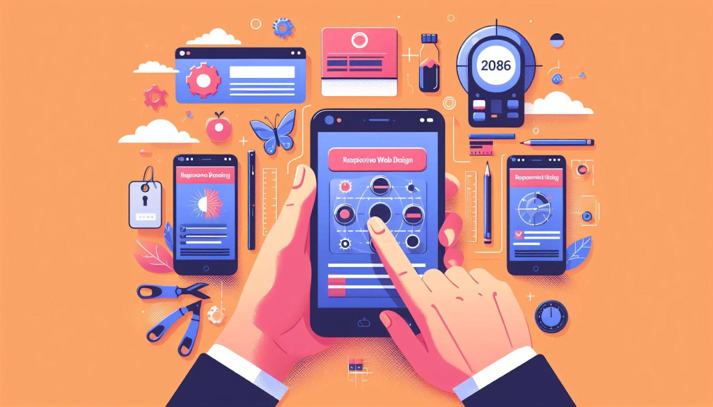
In today’s hyper-connected world, where smartphones reign supreme, ensuring your website offers a seamless mobile experience is no longer a luxury, it’s a necessity. This is where responsive web design (RWD) comes in. RWD is a website design approach that creates a single website that adapts its layout and content to perfectly fit any device – from smartphones and tablets to laptops and desktop
Think of it as a website that’s like a responsive yoga instructor, effortlessly adjusting to any screen size thrown its way! But the benefits of RWD go far beyond aesthetics. Here’s why you should prioritize a mobile-first approach when considering website design services from a website design company in Bangalore:
Mobile Reigns Supreme: Let’s face it, we’re a mobile-first society. According to Statcounter, over 56% of all web traffic globally comes from smartphones. That means if your website isn’t optimized for mobile users, you’re essentially turning away a majority of your potential audience.
Enhanced User Experience (UX): Imagine squinting at tiny text or struggling to navigate a cluttered website on your phone. Not a pleasant experience, right? RWD ensures your website is easy to navigate, with clear calls to action and content that’s easily readable on any screen. This translates to happy users who are more likely to stay engaged and convert.
Improved Search Engine Optimization (SEO): Search engines like Google prioritize mobile-friendly websites in search results. A responsive website ensures your content is properly indexed and displayed across all devices, giving you a significant SEO advantage. This can significantly improve your ranking on search engine results pages (SERPs), making it easier for potential customers to find you.
Reduced Maintenance: Maintaining multiple websites for different devices can be a nightmare. With RWD, you only need to manage a single website, saving you time and resources. A website development agency specializing in RWD can ensure your website is built with scalability and future-proofing in mind, adapting seamlessly to new devices and screen sizes as technology evolves.
Here’s how a website design company in Bangalore can help you implement a mobile-first RWD strategy:
- Understanding Your Target Audience: They’ll work with you to understand your target audience and their browsing habits. This helps tailor the mobile experience to their specific needs.
- Prioritizing Content Hierarchy: They’ll prioritize your website’s content to ensure the most important information is displayed first on mobile screens.
- Optimizing Images and Videos: They’ll ensure all images and videos are optimized for mobile loading speeds, keeping your website fast and responsive.
- Touch-Friendly Navigation: They’ll design intuitive navigation that’s easy to use with fingers, ensuring a smooth user experience on touchscreens.
Beyond the Basics: Optimizing Your Mobile Experience :
While RWD is the foundation, there’s more to creating an exceptional mobile experience. Here are some additional tips:
- Fast Loading Speeds: Nobody likes a slow website. Your website design company will ensure your site is optimized for mobile data speeds, keeping users engaged.
- Focus on Local SEO: If you have a local business, optimize your website for local searches. This includes ensuring your Google My Business listing is up-to-date and your contact information is easily accessible on mobile.
- Embrace Accelerated Mobile Pages (AMP): Consider implementing AMP, an open-source framework that helps create lightning-fast mobile web pages, further enhancing user experience.
Investing in a mobile-first website design is an investment in your business’s future. By partnering with a website design company in Bangalore that specializes in RWD and mobile optimization, you can ensure your website delivers a seamless and engaging experience for all users, on any device. Ready to take your website mobile-first? Contact a website development agency today and unlock the power of responsive web design!