In 2026, the global e-commerce industry will have fully shifted to a mobile-driven development landscape. Mobile shopping has long outgrown its former identity as a supplementary option to desktop shopping and has become the mainstream shopping scenario for millions of consumers worldwide.
Users complete their full-cycle consumption behaviors—product browsing, price comparison, review checking, order placement, and brand interaction—entirely via mobile phones.
Enterprises must abandon the outdated desktop-first website building mindset and clarify a common cognitive misconception: mobile-first e-commerce websites are not merely responsive websites adapted for small screens. Instead, they represent a complete strategy that prioritizes mobile usability, loading speed, accessibility, navigation logic, and conversion optimization from the initial design stage.
In 2026, mainstream search engines will have listed mobile experience as a core ranking factor. Technical SEO elements, including Core Web Vitals, AI-powered indexing, voice search compatibility, and even PrestaShop-friendly URLs, all impact both a site’s traffic and conversion efficiency.
This article will explore the best practices for building mobile-first e-commerce websites in 2026 to help enterprises maintain competitiveness in the mobile-centric digital market.
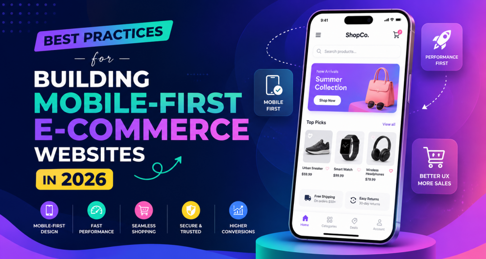
Why Mobile-First Design Matters in 2026
In 2026, the importance of mobile-first design for the e-commerce industry will become increasingly prominent. Driven by users’ ongoing demand for convenience and speed, mobile e-commerce will sustain its rapid high-growth trend.
Consumers complete purchases in four types of fragmented scenarios:
- while commuting,
- scrolling through video content,
- browsing social media,
- and using voice assistants.
User behaviors have reshaped consumer expectations, which require seven core mobile experience standards; brands that fail to meet these requirements will lose their customers to competitors.
Mobile-first is a strategy that centers design on convenience, rather than retrofitting desktop-focused designs for mobile use after the fact.
This strategy can deliver seven core business benefits, and e-commerce operators’ mobile optimization work is directly linked to their own profitability.
Prioritizing Mobile Website Speed and Performance
Next, we propose the core principle of this optimization: prioritizing the speed and performance of mobile websites.
In 2026, website speed will remain a core factor influencing search rankings and user conversion. Mobile users have extremely low tolerance for slow-loading websites, and industry research confirms that even a 1-second loading delay will significantly cut conversion volume.
We have sorted out 5 implementable performance improvement measures.
Lightweight Website Architecture
Avoid bloated code, excessive plugins, and unnecessary scripts. Clean website architecture improves loading speed and overall usability.
Optimized Images
Use next-generation image formats like WebP and AVIF to reduce file sizes without sacrificing quality.
Lazy Loading
Lazy loading ensures images and videos load only when users scroll to them, improving initial page speed.
Content Delivery Networks (CDNs)
CDNs distribute website content across global servers, reducing latency and improving performance for mobile users worldwide.
Efficient Hosting
Fast hosting infrastructure is essential for mobile responsiveness and scalability.
A faster mobile website leads to:
- Lower bounce rates
- Higher engagement
- Better search rankings
- Increased conversions
All operational standards are clearly defined, and proprietary terms retain their original English versions, which greatly lowers the information access barrier for readers.
Thumb-Friendly Mobile Navigation
Unlike the interaction logic for desktop devices, smartphone users use their thumbs as their core operation carrier.
For mobile-first e-commerce websites to succeed in 2026, they must implement thumb-friendly ergonomic navigation, roll out 6 actionable best practices, and support 4 core user operation goals.
Best Practices for Mobile Navigation
- Use large tap targets
- Place key actions within thumb reach
- Simplify navigation menus
- Avoid overcrowded layouts
- Minimize typing requirements
- Use sticky navigation bars
Navigation should feel effortless and intuitive.
Users should be able to:
- Browse categories easily
- Find products quickly
- Access the cart instantly
- Complete purchases smoothly
Complex navigation will raise user frustration and drag down e-commerce conversion rates.
Optimizing the Mobile Checkout Experience
Cart abandonment remains one of the biggest challenges in eCommerce.
A complicated mobile checkout process often leads to lost sales.
In 2026, mobile-first checkout experiences prioritize simplicity and speed.
Best Practices for Mobile Checkout
Offer Guest Checkout
Many users abandon purchases when forced to create accounts.
Minimize Form Fields
Request only essential information during checkout.
Use Autofill Features
Autofill reduces typing effort and accelerates transactions.
Enable Digital Wallets
Support payment systems such as:
- Apple Pay
- Google Pay
- PayPal
- Buy Now Pay Later solutions
Display Progress Indicators
Progress bars help users understand how many steps remain in the checkout process.
Optimize Error Handling
Clearly explain form errors in real time to prevent frustration.
A frictionless checkout experience significantly improves mobile conversions.
Mobile Product Page Optimization
This paper proposes that mobile product pages are the core influencing factor for mobile shopping decision-making.
Successful product pages in 2026 must integrate three core characteristics—speed, clarity, and personalization- and include 7 essential functions,
- High-quality but optimized images
- Swipeable image galleries
- Short, scannable descriptions
- Clear pricing visibility
- Prominent CTA buttons
- Mobile-friendly reviews
- AI-powered recommendations
and follow the design principle of prioritizing minimalism to avoid clutter, so as to improve users’ decision-making efficiency and shopping satisfaction.
AI-Powered Mobile Commerce Experiences
In 2026, AI is revolutionizing mobile commerce experiences.
Leveraging five categories of user data—browsing behavior, purchase history, device usage, geographic location, and user preferences—it enables the implementation of five application scenarios:
- personalized product recommendations,
- dynamic homepages,
- predictive search,
- intelligent ranking,
- and exclusive discounts.
These applications can boost user engagement, drive repeat purchases, and reduce users’ decision fatigue.
Voice Search Optimization for Mobile Commerce
With the popularization of AI assistants and smart devices, voice search has grown rapidly.
Mobile users’ search behavior has shifted from using traditional keywords to conversational phrases.
By implementing five optimization measures, use natural language content
- Answer common customer questions
- Improve local SEO
- Optimize loading speed
- Use structured data markup,
Enterprises can efficiently reach users and improve the discoverability of their content.
Mobile-First SEO Best Practices
At present, the mobile-first approach has become deeply integrated with search engine optimization (SEO).
Search engines prioritize ranking websites that feature strong mobile usability and a positive user experience.
To implement mobile SEO effectively, operators can follow five core actionable practices:
- adopting PrestaShop-style concise URLs to improve page readability and indexing efficiency,
- adapting meta tags to fit mobile SERPs,
- refining internal linking to enhance crawler accessibility and user engagement,
- using Schema markup to structure data and help search engines identify site information,
- and avoiding intrusive pop-ups that would harm user experience and SEO performance.
Proper execution of these measures can boost a website’s exposure and attract higher-quality visitor traffic.
Responsive Design vs Adaptive Design
Among the core development trends of web design in 2026, responsive design remains an essential requirement, while adaptive design is gaining increasing importance.
The former adjusts content size according to screen dimensions, while the latter generates personalized layouts tailored to different usage scenarios.
Most mainstream mobile-first e-commerce websites integrate both approaches and rely on five practical implementation scenarios to deliver a seamless cross-device user experience.
Accessibility in Mobile E-commerce
As an industry standard requirement for website development, the accessibility of mobile websites has long ceased to be an optional configuration, and must be adapted to accommodate users with varying abilities and needs.
We have collated 6 accessibility best practices.
- Use readable font sizes
- Ensure strong color contrast
- Add alternative text for images
- Support screen readers
- Provide keyboard navigation
- Avoid overly complex animations
Inclusive design can improve the user experience for all users, support regulatory compliance, optimize search rankings, and build long-term user trust.
Progressive Web Apps (PWAs)
Progressive Web Apps (PWAs) are projected to remain steadily popular through 2026.
This technology combines the advantages of standard websites and native mobile applications, boasts five core characteristics,
- Fast loading speeds
- Offline functionality
- Push notifications
- App-like experiences
- Improved mobile performance
and can improve e-commerce platforms’ user engagement and retention rates without requiring users to download native apps.
PrestaShop already provides integration support for PWAs.
Advanced Search and Filtering Optimization
In the mobile e-commerce scenario, the search function is core to business success. Users are only willing to invest very little effort to locate products.
Mobile Search Best Practices
- Predictive search suggestions
- AI-powered autocomplete
- Voice search support
- Smart filtering systems
- Visual search functionality
Filters should be:
- Easy to access
- Simple to understand
- Optimized for touch interactions
Implementing five categories of search optimizations, three filtering requirements, and configuring an advanced search function can improve user satisfaction and reduce page bounce rates.
Microinteractions and Mobile UI Design
In mobile UI design, we can leverage microinteractions to boost user engagement.
These refined animated feedback tools include five commonly used forms, which can improve the user experience. Examples include:
- Button animations
- Swipe effects
- Loading indicators
- Haptic feedback
- Interactive product galleries
However, overuse of such elements must be avoided, and designs must be balanced to ensure consistent operational performance.
Data-Driven UX Optimization
Focusing on Use Data-Driven UX Optimization, in 2026, eCommerce businesses need to rely on behavioral analytics and AI-powered insights to identify 5 categories of UX pain points, achieve on-the-ground implementation via 4 types of tools and quickly adapt to changes in consumer behavior.
Data-driven optimization helps identify:
- Drop-off points
- Navigation issues
- Checkout friction
- User hesitation patterns
- Mobile usability problems
Key tools include:
- Heatmaps
- Session recordings
- AI analytics
- A/B testing platforms
Building Trust in Mobile E-commerce
The authors of this paper propose a trust-building scheme for mobile e-commerce.
They note that users’ anxiety over personal security and privacy is on the rise, and that trust is the core determinant of conversion rates.
Important Mobile Trust Elements
- SSL certificates
- Secure payment badges
- Transparent return policies
- Customer reviews
- Privacy compliance notices
Mobile Content Consumption Optimization
The mobile content consumption optimization scheme proposed in this paper must first clarify that there are differences in content consumption habits between mobile-end and desktop-end users.
The scheme must implement adaptation requirements, including short paragraphs, large font sizes, and adequate white space.
Its core goal is to guide users to complete their purchase decisions, while avoiding imposing unnecessary information burdens.
Automation in Mobile E-commerce
Automation reduces friction in mobile e-commerce.
It is a core component of mobile-first e-commerce experiences, supporting use cases including customer service, personalized content pushes, and inventory updates.
It boosts operational efficiency and improves user experience, enabling businesses to serve users efficiently without adding extra operational complexity.
Social Commerce Integration
Global social e-commerce will enter a phase of rapid expansion in 2026.
Mobile users are increasingly inclined to complete product discovery and purchase directly through social platforms, so e-commerce websites must integrate five core social functions to build a more attractive and credible shopping experience.
- Social login options
- User-generated content
- Influencer integrations
- Social proof widgets
- Shoppable videos
Emerging Mobile Technologies and Future Trends
The authors of this paper propose that it is necessary to break the entrenched perception that mobile commerce relies solely on smartphones, proactively deploy six categories of emerging mobile technologies, and build robust long-term competitiveness through mobile-first design.
- Foldable devices
- Wearable commerce
- AR shopping experiences
- AI shopping assistants
- Spatial computing
- Voice commerce
Brands that complete this transformation early will secure a stronger market position.
Customer Retention Through Mobile UX
In China’s domestic internet industry, customer acquisition costs continue to rise, and the strategic importance of customer retention far exceeds that of any previous period.
High-quality mobile user experience (UX) can generate five core business values;
- Repeat purchases
- Brand loyalty
- Higher customer lifetime value
- Positive reviews
- Referral traffic
Relevant UX strategies must focus on three core directions: convenience, personalization, and emotional connection.
Conclusion
By 2026, building mobile-first e-commerce websites will long have outgrown the basic requirement of relying solely on responsive design.
Enterprises must develop intelligent experiences that align with consumers’ continuously changing expectations, and roll out core modules including AI-powered personalization, simplified checkout, advanced SEO, and adaptive design.
Businesses can leverage PrestaShop’s user-friendly URL structure to optimize performance and search visibility, while the platform’s built-in advanced integration and automation capabilities can also adapt to these operational needs.
Mobile-first has evolved from an industry trend into a core foundation for e-commerce growth, and only by making forward-looking preparations can enterprises achieve long-term success amid intensifying digital competition.