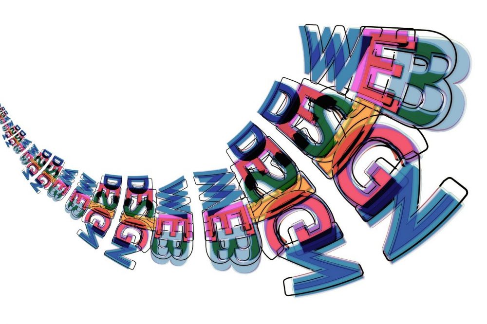
The world wide web is a crowded place. Every day people get bombarded with an overwhelming amount of information. So, to stand out businesses need to create a design that captures attention. This can be done in many different ways such as interesting visuals or great fonts but one tool that often gets overlooked is color; however, it shouldn’t! Color has been proven time and again (by science!) as being one of the most powerful tools when designing anything because people are very sensitive about what they see even if don’t realize it themselves. Color psychology seeks to understand how different colors affect human behavior, emotions, and perception which makes choosing the right palette not just an aesthetic decision but also a strategic move too. These principles will help guide you in your selection process.
Understanding Color Psychology
Color psychology is the study of how colors influence feelings and behaviors. Each color evokes a unique emotion which can have an impact on user engagement with websites. Here are some common colors along with their psychological implications:
Red: Often associated with love, danger, or passion; used frequently for food sites or CTAs where appetites need stimulating!
Blue: Represents trustworthiness, calmness, and professionalism – a perfect choice for corporate or financial sectors because users want peace of mind when dealing with money matters.
Green: Symbolizes nature, health, and tranquility so often found combined together within wellness industry sites such as spas etcetera.
Yellow: Known mostly for happiness & optimism; good brands trying to convey cheerfulness could use this extensively but not all at once though!
Purple: Its luxuriousness creativity wisdom – hence why beauty products tend towards it more than any other hue.
Orange: Represents enthusiasm energy – must-have shade for CTA buttons or promotions that need highlighting!
Black: Stands tall elegant sophistication power hence high-end items always come packaged in black boxes plus minimalistic designs too.
The power of a consistent palette
A consistent color scheme can make or break a user’s experience on your website. Inconsistency with colors might confuse visitors and take away from the main point of the web page. A well-thought-out palette not only makes things look good but also establishes what the brand is all about.
Steps to picking your perfect colors
Identify Your Brand: Determine who you are as an organization before thinking about what colors should represent it. Let everything reflect this starting from logos to slogans. For example; if I were running my own tech start-up company then I would want blues and greys because those show innovation while remaining professional looking but if it’s just another children’s toy store then bright fun shades will work best.
Know Your Audience: Different age groups respond differently towards certain hues so understanding which ones work best for you can be vital in converting leads into sales. This means doing market research to find out which colors resonate most with your target demographic. Younger generations may like flashy trendy combinations whereas older people will prefer more subtle timeless ones.
Basic Colour Theory: Get familiarized with the basics such as complementary or analogous schemes as well as knowing where different types fall on a wheel diagram etcetera etcetera. These will help you know how much contrast there should be between two sections (or more) of content when choosing colors that go together.
Remembering Accessibility: Always consider viewership accessibility even during times when creativity seems paramount above all else because everyone deserves equal opportunity access regardless of their abilities especially visually-impaired individuals who rely heavily upon high contrast combinations for better readability; therefore, tools like WebAIM Contrast Checker come in handy here.
Test It Out!: Play around until you get right by creating mock-ups based on real feedback received after showing various people different options side by side – an approach known as A/B testing can be extremely useful here since it shows how user behavior changes with different color choices.
RGB to Hexadecimal Conversion
Knowing how color formats work is important in digital design. In web design, the RGB (Red, Green, Blue) model is commonly used because of this. All colors in this model are made up of combinations from these three primary colors; they have values between 0 and 255. A six-digit code called Hex code (Hexadecimal) number system represents RGB values which can be used in CSS for styling webpages.
For instance, the RGB value for Sky Blue is (135, 206, 235). In hexadecimal notation, it can be written as #87CEEB. Here’s how you convert RGB to Hex:
Write down each decimal number equivalent to a hexadecimal number.
Combine the hex values into one six-digit number.
So if you know these conversions, it becomes easy to ensure that your designs look consistent on different platforms.
In Conclusion
Color psychology is a powerful tool for website designers because it influences user behavior and perception greatly. Understanding what emotions are associated with which colors can help you create visually appealing websites that also align with your brand’s personality while considering who will be visiting them too. So always keep in mind that not only does an attractive color scheme beautify but also improves interactions thereby strengthening client loyalty towards a particular brand through ensuring positive experiences during browsing sessions across various devices thus increasing conversion rates exponentially ultimately leading to higher ROI numbers otherwise known as happy clients!

