It’s a sad reality that outside paint choices usually get ignored, but they matter much more than people think. Most homeowners pour their entire budget into indoor renovations, assuming the outside just needs to look clean enough to pass inspection. Curb appeal isn’t magic – it shows when someone took time – when care was applied with intention. Some paints lift a house up, helping it seem like it belongs in the neighborhood; others drag it down, making it seem tired or out of place.
Facades are first impressions for every visitor. Bright, aggressive, or mismatched tones alter how guests perceive the entire building. People scanning the front of a house instantly determine whether the owner prioritized design or ignored it completely. Choosing one hue with intention gives the structure a stronger visual personality, but beware – picking a shade that clashes with the neighborhood makes a house look ancient, even on fresh walls.
Color as an Architectural Tool
Designers treat exterior color as a high-level tool rather than a mere decorative layer. Various hues interact with structural lines in surprisingly distinct ways. Light shades make cramped buildings feel larger, airy, and open to the street. Darker, moodier tones ground a house and emphasize its architectural form perfectly.
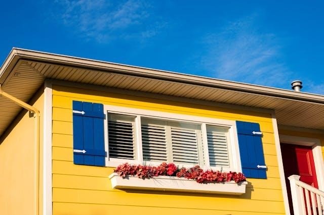
Trim and accent colors carry significant weight here. Strategic contrast guides the human eye across the facade, grounding the windows, doors, and complex rooflines into a unified sight. When the trim blends too closely with the siding, those interesting architectural details melt into a murky mess. When the contrast hits too hard, the entire exterior feels choppy and fragmented.
Architectural style defines the boundaries of your palette. Traditional homes typically thrive on classic, soft contrast schemes. Modern, contemporary designs accommodate bolder or purely monochromatic choices with zero effort. Color functions best when it supports the existing skeleton of the house instead of fighting against its own DNA.
The Influence of Light, Climate, and Surroundings
Natural light constantly changes, altering how pigment looks throughout the passing day. Climate dictates how finishes endure the elements over many years. A warm, inviting buttery yellow in Georgia might look sickly or flat under the gray, heavy skies of more northern regions.
Out in the sun, colors shift more than you might expect. When it burns bright, pale shades fade while dark ones grow heavier, almost harsh. In chillier spots, bold pigments lose some punch, feeling gentler on the eyes. Try brushing actual swatches across different walls of your house before picking one single hue.
Hidden among dense plants, a small house feels right with colors drawn from soil and leaves. Because of nearby buildings or open land, choices shift in subtle ways. Sharp lines and smooth finishes suit city spaces better than rustic ones. Nature’s layout – trees, hills, stone – affects what works where.
Color and Perceived Home Value
Cohesive choices bump up the perceived value of any property. Houses that appear well thought out are subconsciously viewed as better maintained by every potential buyer walking down the street. Impressions form in seconds.
Neutral palettes with a touch of character almost always win in the real estate market. These adaptable colors allow prospective buyers to imagine their own lives inside your walls. Choosing neutral does not mandate painting your home beige or gray. Muted blues, deep greens, or muddy, warm off-whites provide personality without killing the curb appeal.
Poor selections date a house instantly or make it stand out for the wrong reasons. Trendy, aggressive shades often require expensive corrections later. Planning protects your financial investment.
Exterior Materials and Color Compatibility
Exterior materials hold the final authority over your color success. Siding texture, surface sheen, and board profile dictate how light reflects or absorbs. Smooth wood reflects differently than rough stucco. Glossy finishes behave entirely differently than matte coatings under the midday sun.
Anyone updating their cladding or performing major repairs must coordinate everything at once. Installing new siding changes how a paint option performs compared to the old, weathered material you replaced. Professional advice helps bridge this gap.
In many regions, exterior materials and finishes must work harder over time to keep up their long-term durability. As an example, homeowners working with siding contractors in Wichita, KS understand that there’s a lot of wide temperature swings, strong winds, and intense sun exposure that can affect how long the siding lasts.
Color is a very important part of the exterior in preventing damage. Lighter colors that reflect the sun’s rays can prevent heat from getting absorbed, which helps prevent the siding from warping. On the other hand, darker finishes will deteriorate quicker under constant sun exposure. A home looks better when the material and the color work as a singular, intentional unit.
Using Color to Create Visual Balance
Proportions can be corrected or hidden through clever use of tone. Tall, thin homes look better with lighter upper gables to reduce that vertical, stretched-out feeling. Wide, flat houses look better when broken up by dark trim or varied accent zones.
Painting your garage door to match the primary siding makes it recede, which pushes the focus toward a more attractive front entry. These subtle shifts change the way the human eye navigates the building. Balance remains the goal for any property.
Longevity Over Trends
Paint lasts longer than fads ever could. Fixing outside walls takes way more cash than redoing an inside room. That kind of expense means holding back makes sense. What matters sticks around.
Old favorites aren’t dull by default. Quiet differences, slight warmth changes, yet smart opposition hold attention across years. People who care about lasting value watch their spaces mature well. Even when trends move on, the house stays in step without trying.
The Emotional Impact of Exterior Color
Emotional resonance is the final layer. Warm, earthy colors make a house feel approachable and safe. Cool, crisp blues often convey a sense of calm and precision. Deep, charcoal hues communicate sophisticated confidence. Returning to a home that aligns with your personal taste provides a deep sense of pride every single day.
People who truly love their home exterior keep up with the maintenance schedules more consistently. A nice house creates a positive cycle of value.
Planning Before Committing
Planning demands patience. Testing samples during different times of the day remains standard practice. You must evaluate how the color interacts with your stone veneer or your roofing shingles before opening a single can.
Experienced professionals help translate your abstract vision into a workable construction plan. They know how materials actually behave under the pressure of local weather patterns. Avoiding regret starts with preparation.
Conclusion
A fresh coat of paint changes how a place looks, feels, even what it’s worth. House history matters – so do nearby trees, weather patterns – affecting which hues last best. Color shifts from mere decoration into something smarter, almost like planning ahead. It stops being about appearance alone once you see how it fits the whole picture.
Choosing carefully lets homeowners shape how their house feels, long after the paint dries. A well-picked color wakes up the exterior, guiding strangers’ eyes before they step near. Small shifts hold weight – they can redraw the whole look without moving a wall. Pause here. Think it through. Then live with what you’ve built, day by day.