Creating a gallery of art is ideal for giving your home space its character—an original, elegant, and differentiating resource to decorate.
Many people invest much of their time and money in creating their art collection. The idea of making additions to the place where we live is one of the most basic human instincts and one of the main functions of art collecting. But it is ironic that when the time comes to enjoy and hang them up to be seen, plenty of mistakes are made. Those mistakes hinder the appreciation of the work and even compromise the condition or conservation of the pieces.
In decoration, there are no absolute rules because many decisions depend on the taste of each one in the end. However, we can consider a series of unwritten patterns that make things look better—something like basic and infallible guidelines. The following tips will help you to learn about those foolproof guidelines and become better at hanging your art.
Respect the scale
You may already know that in decoration, proportion is one of the critical factors to keep in mind, and this also applies to art. It is essential to maintain a specific scale when choosing what you are going to hang. Therefore, if the wall is large, it is better to select a large painting or several compositions.
You have to place your work more or less centered in the available space in the first case. On the other hand, if the wall is small, you can combine small paintings with some medium ones to fit the whole proportion.
Height over furniture
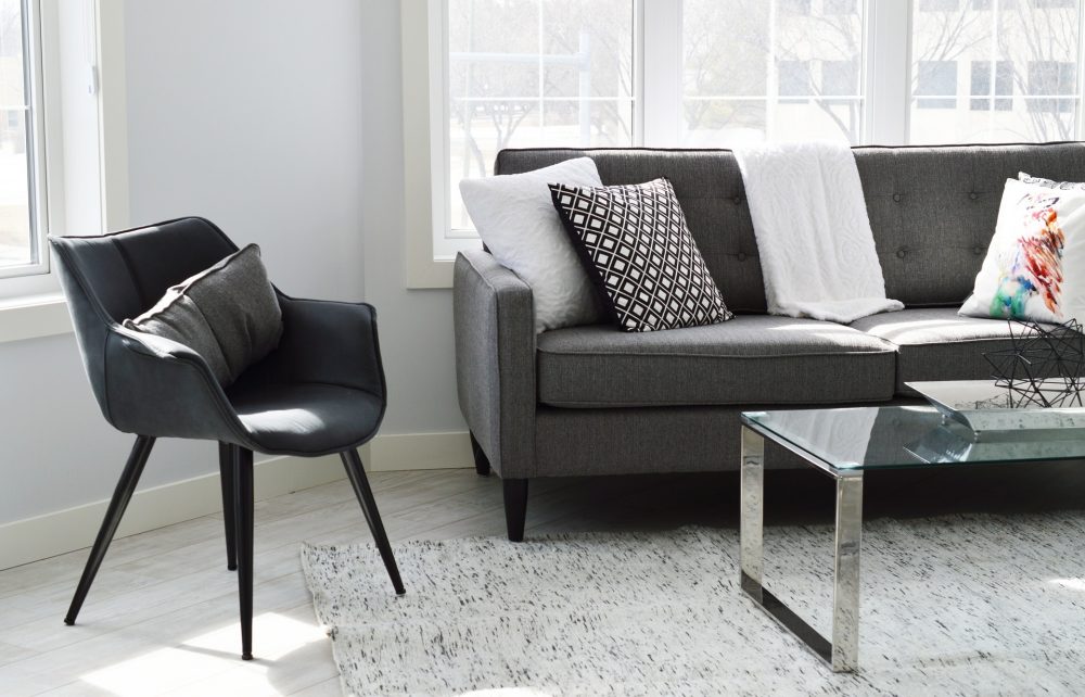
If there is an element below, the painting should not be closer to the ceiling than that object. If you are going to place it above a sofa, headboard, closet, etc. try to leave a space between 12 and 19 inches (30 and 50 cm) between the end of the furniture and the painting without being too close to the ceiling, and a small space between the highest paintings and the ceiling.
But it should always be more separated from the roof than from the furniture. And the piece of art should always be narrower than the piece of furniture on which it is placed.
Groupings
In recent years, it has become a trend to create galleries on walls with many works. Although seeing them may give the impression that they are the result of chance, these compositions are studied and thought out in advance to be balanced and not chaotic, and there are some rules to follow to achieve this.
The first is to start with the largest work of art, which we will never place in the center, always on one side. Then we will place the other pieces around it, making sure not to put too large or two small pieces together and covering from side to side and from floor to ceiling.
The choice is yours. If you like order, then go for compositions in which symmetry rules. The traditional way to place your paintings is to put them side by side, keeping the exact distance between them. Because with symmetrical compositions, you are practically assured of success. They are more straightforward and are a success if you are looking for a sense of order and balance.
But if you are looking for dynamism, then irregular compositions will fit much better with your personality. Keep in mind that a cluttered style requires careful selection so that the result is visually pleasing. And you may need some round or oval element because it will help to accentuate the asymmetrical effect and make the composition more dynamic.
In both styles, the pictures are aligned in all corners, giving a sense of order. The difference lies in the fact that art pieces are displayed at different heights in the second one.
You can also place some pictures following certain lines and others asymmetrically. And, of course, take into account the colors of the paintings as you will do several tests until you find the optimal result. It is essential to take pictures to make it easier to choose the winning composition.
Horizontal or vertical alignment
A vertical composition will create the sensation that the ceilings are higher. And horizontally, by contrast, is suitable for hallways or over sofas of more than three seats.
Creating geometric shapes also balances the wall space. Play with the conditions of the art and create a geometric composition. The central pictures can be of the same size. And on the sides, the figures can be reversed.
Don’t forget the staircase alignment. Placing pictures in a staircase style will represent the movement of the stairs, giving a sense of continuity. For this reason you should follow the inclination of a staircase. Of course, as long as they are at eye level.
Stairway
There is a small, advantageous technique. This consists of placing the pictures in a staircase, following the silhouette of the stairs. If you put them in a staggered way, you will get a magazine decoration.
Do you have a staircase that has a small landing before going up to the second floor? In this case, don’t overload the staircase and take advantage of this landing to place a painting on each wall.
Let’s say your staircase is not too “long,” and you are only going down a few steps. Or, maybe you are a more straightforward person, and you don’t like crowded spaces. In these cases, just put two or three pictures covering the walls, at different levels, so you can see them as you go down the stairs.