The artist managers and record labels of nouveau artists usually do not have experienced graphic designers and creative teams on the go to deal with the websites of their artists, and so they partner with the various marketing agencies. Although partnering up with professionals might provide one with top-notch results, hiring a freelancer might serve the purpose as well, especially when budget and time are both limited. One might consider constructing it on their own after mastering some of the basic rules about UI and your UX.
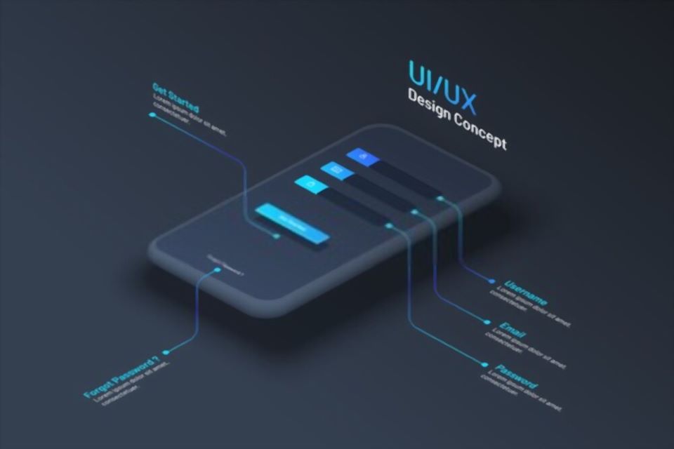
User interface or UI are the visual aspects of the website enabling the user to interact with the page, including various items like menus, buttons, links displays. User Experience or UX deals with the emotional and psychological aspect, describing the user’s experience operating and using the website. Web designing depends entirely on remarkable user experience. The goal is to keep the user engrossed in the website, and to make them feel good about the entire experience.
The user interface of a website plays a pivotal role in the user experience. To achieve a good user interface must keep in mind these necessary nine tips as discussed below, before designing a website so find out here to hire best ui ux designer.
Know Your Audience
The most important aspect is to know the artist’s targeted audience and plan the website according to their interests. For example, if most of the audience of the artist belong to the age group of 20s, they would probably be interested in the latest trends of technology and social media icons. But if the audience belongs to the age group of late 50s or above, sticking to straightforward layouts, larger fonts, or the retro theme might be useful.
Keep It Minimal
Another important tip is to keep the motto, ‘Less is more!’. It is always a wise idea to keep a brief overview of the homepage with detailed information on the other pages. For example, whilst designing a website for a new artist, one might add a short one-sentence description page and more information on the About page. This would increase the audience base and keep them genuinely interested in the website.
Avoid Overwhelming Choices
One might restrain from devising too many options in their respective websites, as it overwhelms the user and makes it difficult for them to make a decision if they arrive at the website for the first time. Too many options compare the user to avoid the decision and move on completely.
Engage Visitors with Interactive Features
A respective website is one’s own branded domain, and while designing it the goal must be to keep the visitors engrossed for as long as possible. Use of a music player embedded in the website might be a good idea.
Use High-Quality Visuals and Videos
Devising high-quality visuals and impactful videos in the websites goes a long way in drawing users in, thereby keeping them emotionally invested. For example, visuals which depict stories related to the artist and his music might grab more audience as they would connect with the artist on both emotional and artistic grounds.
Ensure Responsiveness and Skimmable Content
The website must have responsive capability and the mobile experience should be as enthralling as the desktop experience. It is extremely common though the web pages does tend to skim on the website, avoiding chunks of data which they consider to be unimportant. Most readers want to gather the data as fast as possible. The aim while designing the page must be to optimize the text and make them as skimmable as possible, using brief headlines with larger font size, bullet notes, etc.
Optimize Text Layout for Readability
If a large amount of text is needed on the site the goal is to keep the viewing experience optimal. Columns that are too wide can make readers feel like they’ve been reading for a long time. Columns that are too short make them feel as if they have been galloping from line to line.
Follow Established Design Patterns
Using design patterns or UI that are established is a wise idea to avoid confusion for the readers. For example, placing a logo in the top left corner is a common design. It is familiar to most users. This should not be changed unless absolutely necessary.
Avoid Misaligned Design Elements
Some design patterns should be avoided even if they are widely used. This is true when the target audience does not relate to them. For example, many middle-aged internet users may not recognize certain popular icons. They may have never used them. Including these icons on a website might not be a good idea.
Author Bio:
Sunny Chawla is a Managing Director at Alliance Recruitment Agency. He specializes in helping client for international recruiting, staffing, HR services and Careers advice service for overseas and international businesses.