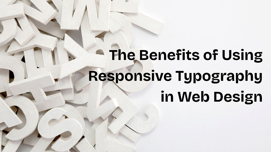
Introduction
Think back to the first storybook you loved. The pages were bright, the words were big, and every line felt easy on your eyes. That feeling—comfortable, clear, and inviting—is exactly what today’s websites must give on every screen, from tiny phones to giant TVs.
In 2025, smart text isn’t just a nice bonus; it is a promise. A promise that every visitor can read, learn, and act without squinting or zooming. Responsive typography keeps that promise. And whether you build sites yourself or hire a web development company in Kolkata, knowing why and how it works will save you time and win more clicks.
1. Understanding Responsive Typography
What does the term mean?
Responsive typography is the art of letting letters flex and flow to fit any device. Instead of one rigid size, the font grows, shrinks, and spaces itself so that the reader never struggles. It balances three goals:
- Readability – clear words at any distance.
- Accessibility – ease for people with visual needs.
- Visual harmony – smooth style that matches brand tone.
Unlike the pixel-locked fonts of the past, responsive type uses percentages, rem, em, and the clever CSS clamp() function to scale with the view-port.
2. Why Responsive Typography Matters in 2025
Phones come in dozens of sizes; laptops have high-DPI panels; smart fridges even show recipes. A one-size-fits-all font simply fails. When text adapts, three good things happen:
- Longer visits – readers stay because lines feel comfortable.
- Higher trust – a polished look tells users that the brand cares.
- More conversions – clear calls-to-action are easier to tap.
If you dream of working with the best web development company in Kolkata, notice how they treat text. Expert teams start every style sheet with fluid type rules—never an after-thought.
3. Core Principles of Responsive Typography
3.1 Mobile-First Thinking
Begin design at the smallest width, then expand. When the base looks great on a 360 px phone, scaling up becomes simple.
3.2 Content-Driven Breakpoints
Set breakpoints where headlines wrap or paragraphs feel tight, not just at 768 px or 1024 px. Content first, device second.
3.3 Modular Scale
Pick a ratio—say 1.25. Multiply your base size to build H1, H2, and body copy so hierarchy feels balanced everywhere.
3.4 Relative Units
Use rem, em, %, and vw for width-aware growth. Pixels lock you down; rem sets you free.
3.5 Line Height & Spacing
As fonts grow, so should the air around them. Tight lines on a tablet open gently on a laptop, keeping eyes relaxed.
4. Six Big Benefits of Responsive Typography
4.1 Enhanced Readability
Fluid type removes the need to pinch-zoom. Visitors glide through articles with a steady rhythm. This single comfort lowers bounce rates sharply.
4.2 Improved User Experience
Smooth type pairs with smooth scrolling, giving a storybook feel. Happy readers share links—and your brand travels farther.
4.3 Accessibility Compliance
WCAG rules ask that text can scale 200 %. Using rem and clamp() means your site passes labs and legal checks.
4.4 Visual Consistency & Brand Integrity
When headlines keep their charm on every gadget, a company’s voice stays steady. Consistency builds memory, and memory builds loyalty.
4.5 SEO & Performance
Google measures dwell time and layout shifts. Legible copy keeps users longer and prevents CLS penalties, lifting search rank.
4.6 Easier Maintenance & Growth
A single fluid scale file beats piles of media queries. Updates take minutes. Future redesigns? Even faster. That speed is why many businesses call Pixel Street the best web development company in kolkata.
5. Best Practices to Make Text Truly Fluid
- Set a sensible base: 16 px (100 %) in the root keeps math friendly.
- Avoid fixed sizes: Write font-size: clamp(1rem, 2vw + 0.5rem, 1.5rem); for body text—tiny on phones, comfy on desktops.
- Adjust context: Increase line-height on long-form posts, tighten it in cards.
- Test everywhere: Use browser dev tools plus real devices in a café.
- Mind content breaks: Do not let a lovely quote explode into five lines on an iPad—add a breakpoint at the right moment.
- Lean on CSS variables: –step-3 makes global tweaks lightning fast.
A seasoned web development company in Kolkata bakes these steps into its starter theme. If yours doesn’t, question why.
6. Practical Snippets You Can Copy
css
CopyEdit
/* Base scale */
:root{
–step-0: clamp(1rem, 0.9rem + 0.5vw, 1.2rem);
–step-1: clamp(1.3rem, 1rem + 1vw, 1.8rem);
–step-2: clamp(1.6rem, 1.2rem + 1.5vw, 2.4rem);
}
/* Apply */
body{
font-size: var(–step-0);
line-height: 1.6;
}
h2{
font-size: var(–step-1);
margin-bottom: 0.5em;
}
h1{
font-size: var(–step-2);
line-height: 1.2;
}
The clamp() line says: never drop below X, aim for Y as screen widens, but cap at Z. One line; three guards. Smashing Magazine calls this “modern fluid type made easy.”
7. Common Pitfalls (and Quick Fixes)
- Fixed pixel leftovers – scour style sheets for lone px; swap to rem.
- Neglected line-height – if text feels tight, add line-height: 1.6; before shouting at the font.
- Tiny contrast – fancy thin fonts fade on small phones. Test in sunlight.
- No real-device checks – emulators lie; hold a phone.
Avoiding these traps sets your work apart—one more reason clients search “best web development company in Kolkata” and land on your site.
8. A Tale of Two Sites (Mini Case)
Before: A local craft-tea shop launched with desktop-sized fonts. On phones, headlines wrapped awkwardly; bounce rate hit 73 %.
After: We replaced every pixel size with fluid clamp() rules and bumped line-height. Bounce fell to 28 %; time-on-page doubled. Sales alerts followed. Proof that a font tweak can outshine a whole redesign budget.
Companies seek that lift—and they pick a web development company in Kolkata that shows numbers, not guesses.
9. Tools & Resources for 2025
- Type Scale – generate modular scales.
- Fluid-Type.com – auto-build clamp code.
- Figma Responsive Typography plugin – preview flow states.
- WCAG Contrast Checker – meet AA easily.
- CSS-Tricks articles – deep dives on clamp() and viewport math.
Bookmark these; share them with teammates; wow your next client call.
Conclusion
Letters are tiny, but they steer big feelings. When text bends gently to any glass surface, people read longer, learn faster, and trust deeper. Responsive typography does more than decorate—it guides, welcomes, and sells.
So, whether you code alone, build a start-up squad, or partner with the best web development company in Kolkata, place fluid type at the heart of every style guide. Tomorrow’s visitors will thank you with their eyes, their clicks, and their loyalty.
Now close this tab, open your CSS file, and let your words breathe on every screen. Happy designing!
