As the atmosphere around us is getting rid of all the gloominess and sorrow 2020 brought us. Why not do the same with our house. So pick up a brush and start getting creative. Confused about the color trends of 2021, don’t worry we got you. We are going to see a lot of single color design, muted colors, colors found in nature and those which can easily blend in palettes. Let take a look on the color trends that’s going to rule this year.
- Saturated color
After a difficult year filled with sorrow, gloom, and drama, people are now recovering. They are craving to be surrounded by warm hugs and comforting feelings. And so, what’s better way to start by seeing warmer color all around. For the past decade, grey dominated the design world. These colors not only automatically uplift the mood but a splash of them is now the breath of fresh air our spaces needs most. To make them stand out more, use them over pale background that will enhance these colors further and make them more vibrant.
- Monochrome pro
Last year, when the world came to a standstill, everyone stayed holed up in their homes. But as the quote says, life goes on no matter what; gradually, we began adjusting to these times. Our homes doubled as our workplaces. Going out to eat was replaced by cooking at home. One fashion statement that emerged in this year was monochrome trend.
Monochromatic simply means is that you can take one basic color and create a range of hues by playing with various tones, shades and tints that can be created from original. Go for darker shades, medium shades and lighter shades. Monochrome color creates a sense of calm and soothing whereas looking quite elegant at the same time.
- Earthy times
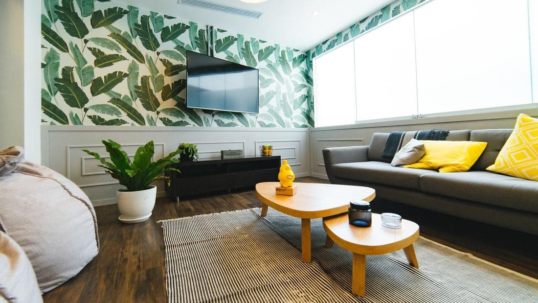
After spending so much times inside our homes, most of us are longing to see different colors. While there is vaccination drive going on in many countries, it can’t be called perfectly safe to venture outside. So what to do now? Well you can design your interior in such way that it creates an illusion of being outside. And for this you can start by changing the color of your walls. You can select the color from earthy tone palette. People are trying to bring a piece of outdoor in their everyday lives and hence gravitating towards the rich and vibrant hues seen in nature such as deep greens and blues, vibrant citrines, chocolate browns and burnt rust. By infusing these earthy colors it will create a sense of comfort and warmth and what more it will be bit of both worlds.
- Pastel palettes
Pastel palettes are best for this purpose, as it brings calm and smoothness in our lives. There is something so relaxing about the lighter shades of the color palettes for your spaces that you want to escape the world you are in. The easy versality of pastel colors the ability to blend with natural materials such as wood paneling, wood floors, rattan sea grass and more in interiors.
If you want contrast in your interiors, you can steers towards rich chicory wood which looks gorgeous with pink and peach colors. You can also try mahogany or deep brown colored stains with pastel yellow, blue or green for a beautiful contrast. You can get creative by observing different sources. Visit your local pastry store, or take a walk through botanical garden. Let your creativity runs wild.
Author’s bio –
Davina Claire is a content marketer who works for a digital marketing agency, Winalll, USA. She helps clients promote their products on Amazon, through Amazon marketing agency.