To create an eye-catching children’s magazine illustration, you need to have an understanding of children’s psychology, vibrant aesthetics, creativity, and educational value. Children are visual learners, and illustrations play a significant role in capturing their attention, conveying messages, and making reading an enjoyable experience.
A well-designed illustration sparks the imagination, supports literacy development, and keeps young readers engaged. In this article, we will discuss the step-by-step process of developing a children’s magazine that captures their attention.
THE STEP-BY-STEP PROCESS OF CULTIVATING A SUCCESSFUL CHILDREN’S MAGAZINE
Let’s begin with the tips that have helped many publishers produce kids’ favourite magazines.
1. Understanding the Target Age Group
The first step, even before starting your magazine, is to determine the age group of your target audience. Different age groups like different things. Consider the following points as reference:
- Children in the age group of 3-6 enjoy shapes, vibrant colours, and friendly characters.
- Age 7-9 would enjoy more complex stories, fun facts, and engaging puzzles.
- Meanwhile, children aged 10-12 prefer detailed illustrations, comics, and theme-based narratives.
For example, children aged 3-6 would love to read a book with large illustrations of animals and basic English words such as “dog” or “tree”, whereas children aged 10-12 would love to read a well-illustrated comic with science fiction adventures and character development.
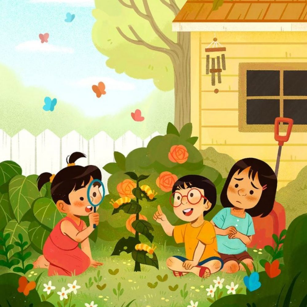
2. Illustration Style and Visual Language
- Consistency & Theme
To create an attention-grabbing children’s magazine, ensure that you maintain a consistent style throughout the magazine. Just as in the above illustration, ensure that the pictures, theme, and illustration follow the same style, flow, and structure, whether they are flat vector graphics, hand-drawn sketches, or digital paintings.
- Character Design
Children respond well to expressive characters. Their big eyes, larger-than-life emotions, and friendly expressions are all the things that make them attractive to little kids. Recurring characters help build a sense of familiarity among young readers.
- Colour Pallet
Bright and bold colours capture children’s attention. Make sure to avoid overly complex or muted tones. Use complementary colours and contrast to highlight important areas such as headers or activity zones.
3. Fonts & Typography
Fonts are one of the important aspects of children’s magazines’ illustrations as they make them appealing and fun for young readers. Here are some useful tips for choosing the right font:
- Font Choice
When choosing the font, you have to make sure that you choose a large, clear, and playful font that is easily readable. Just like the above examples, your fonts should be fun to look at and appealing. Fonts such as Comic Sans, Century Gothic, and Futura are commonly used. Avoid script or overly stylised fonts.
- Font Size and Hierarchy
The size of the font varies according to the sections. Let’s say, larger fonts are suitable for headlines, medium for subheadings, and a readable but smaller font for the rest of the text.
For example:
Heading font size: 35- 30 pts
Sub-heading font size: 24-30 pts
Body text: 14-18 pts
- Text Placement
Text should be wrapped around the magazine illustration organically or be placed in a well-defined box that does not confuse the reader. Avoid clutter by spacing paragraphs and using bullet points as a list of instructions.
4. Layout and Structure
The layout of a children’s magazine is like a masterful synthesis of modular grids, brightly coloured section blocks, and subsequent navigation to help young readers navigate seamlessly. Using two or three column spreads with appreciable whitespace ensures readability and consistent alignment while enhancing visual rhythm.
Highly saturated and contrasting colours are employed for headings and interactive environments. Themed graphic modules, such as puzzles or fact-based sidebars, add variety with a playful twist.
Titles employ bold sans serif fonts while standard subheadings employ mid-sized fonts, and body text uses comprehensible fonts. The intended outcome of the graphic design plan is to create a fun and engaging flow that evokes curiosity and promotes engagement.
5. Cover Page Design
- Create a large, central illustration
- Add bright colours and bold fonts
- Make the title recognisable with a consistent font
- Highlights key features
- Keep the text minimal but impactful
- Use visual anchors and icons
- Introduce interactive visual elements
6. Illustration Integration with Content
Effective book magazine design integrates the illustration according to the content to make sure it boosts engagement and understanding. Characters, mascots, or themed visuals should reflect the topic that guides children through the material.
Make sure to add interactive elements such as puzzles, icons, or stickers to enhance the visual storytelling with different colour layouts and playful fonts for a friendly tone. Visual anchors, such as arrows or themed icons, should also be added, as they help readers navigate the sections.
7. Content and Illustrative Harmony
To create an amazing children’s magazine, you have to make sure that you blend vibrant visuals with meaningful content that captures the attention of young readers.
Each section of the magazine should be interactive and have recurring visuals with a consistent layout that creates familiarity and trust. Professional children illustration UK agencies practice this approach to ensure the children stay engaged during reading.
8. Thematic Design and Seasonal Appeal
Your children’s magazine should align with a central theme, which could be anything, including space, jungles, animals, superheroes, etc. This helps in making sure that they unify the visual style and content. Seasonal editions, such as Halloween, Christmas, or Easter, can be very appealing and allow for some playful designs and changes.
For example, a winter edition of a magazine would have snowflakes, snowmen, and the iceman character from Marvel, or a colouring page with walking penguins.
Frequently Asked Questions
- How often is a children’s magazine published?
They are published monthly or bi-monthly, bringing in fresh content and illustrations.
- Can children contribute to the magazine?
Yes, there is a portion in magazines that allows for children’s drawings, letters, or short stories that boost engagement and reliability.
- Are printed magazines or digital magazines better for children?
Printed magazines are tactile and reduce screen time, but digital magazines offer accessibility and make it even more attractive.
FINAL THOUGHTS
To create a children’s magazine illustration, you don’t only need to make it colourful and fun, but also have to understand what the reader wants. Your magazine needs to be visually engaging and cognitively delivering content that educates, entertains, and inspires children. Through carefully crafting each element, from layout to fonts and illustration design, you will create a magazine that builds a reader’s interest.

