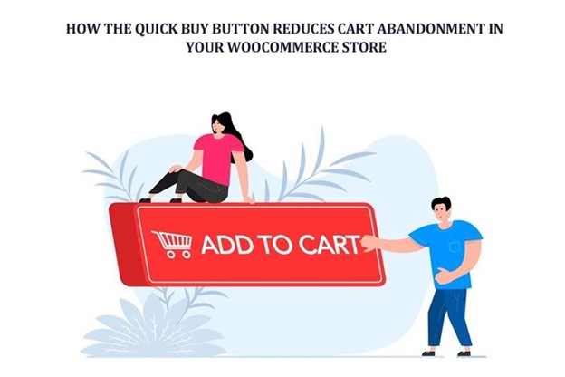
Are you losing potential customers at the very last step of the buying journey, right when they’re about to pay? You see the traffic coming in. Products getting views. People clicking “Add to Cart.” And then nothing.
Orders don’t complete, sales stall. The cart sits there, abandoned, like a shopping trolley left in the middle of an aisle. This is a familiar story for many WooCommerce store owners. Painfully familiar.
Cart abandonment isn’t just a metric. It’s a lost opportunity. And most of the time, it’s not because customers changed their minds about the product. It’s because the buying process asked for too much, too fast, or at the wrong moment. This is where the quick buy button quietly changes the story.
Understanding Cart Abandonment in WooCommerce
Imagine a customer named Alex. Alex finds your product through Google. Likes what they see. Scrolls. Reads reviews. Clicks “Add to Cart.” So far, so good.
Then Alex is redirected to the cart page. Another page loads. More buttons. Extra options. Shipping estimates. A coupon field that triggers doubt is possible. Alex pauses. That pause is dangerous.
Cart abandonment in WooCommerce often happens in these moments of hesitation when intention meets friction, when excitement meets effort.
Statistics tell us abandonment rates hover around 70%. But numbers don’t explain why. Human behavior does.
Traditional WooCommerce Checkout Problem
WooCommerce wasn’t designed to be slow. But it wasn’t designed for impulse either. The default checkout flow is logical. Structured. Step-by-step. Product page. Cart page. Checkout page. Payment. Confirmation.
Each step makes sense on its own. Together, they form a long hallway with too many doors. Customers start walking. Then they wonder if they really need to reach the end. Modern shoppers don’t like hallways. They want shortcuts.
What is a Quick Buy Button?
A Quick Buy Button is that shortcut. It doesn’t shout. It doesn’t complicate things. It simply says, “You’re ready? Let’s go.”
Instead of adding a product to the cart and waiting, customers can move straight toward checkout. Sometimes directly to payment. Sometimes through a clean pop-up. Sometimes, skipping the cart entirely. Less waiting. Less thinking. More doing.
Why Faster Checkout Means Lower Cart Abandonment
Speed changes behavior. When checkout feels instant, customers act on impulse. When it feels slow, they reconsider.
Quick Buy Buttons reduce cart abandonment because they remove time. And time creates doubt. Shorter flows keep customers in motion. Motion creates momentum. Momentum creates conversions. It’s not magic. It’s psychology.
Fewer Steps = Fewer Drop-Off Points
Every extra page is a chance to leave.
A cart page loads slowly? Exit.
Does the checkout form look long? Exit.
Phone buzzes? Exit.
Quick Buy Buttons collapse multiple steps into one. No wandering. No side quests. Just a straight line from interest to payment. And consecutive lines convert better. Always have.
Eliminating the “Cart Review” Delay
Cart pages were designed for shoppers who browse. But many customers already decided. When they hit the cart, doubts creep in. Shipping costs. Totals. “Do I need this now?” thought. Quick Buy Buttons skip this mental trap.
By going straight to checkout, customers stay focused on completion, not reconsideration. That difference matters more than most store owners realize.
Reducing Decision Fatigue
Decision fatigue is real. And it’s sneaky. Colors. Sizes. Upsells. Cross-sells. Coupons. Recommendations. All good ideas. All exhausting.
A Quick Buy Button simplifies the moment—one choice. Buy now. Less thinking. Less pressure. Less abandonment. Sometimes fewer options feel like better service.
Improving Mobile Checkout Experience
Mobile shoppers are impatient. Not rude. Just busy. Tiny screens don’t forgive complex checkout flows. Scrolling. Zooming and tapping small buttons. It adds up.
Quick Buy Buttons are made for thumbs. One tap. One action. Done. For mobile users, convenience isn’t a bonus. It’s a requirement.
Instant Gratification for Impulse Buyers
Impulse buying doesn’t like waiting. When someone wants something now, any delay feels unnecessary. Even a small one. Quick Buy Buttons respect that urgency. They catch the moment before it fades.
Especially useful for flash sales, low-cost items, or trending products. Blink, and the customer is gone. Act fast, and the sale is yours.
Handling Variable Products Without Friction
Variable products are used to slow everything down. Choose a size. Choose a color. Choose a style. Miss one option? Error message.
Modern Quick Buy flows handle this gently. They guide instead of blocking. A reminder appears. Selection happens. The journey continues. Fast doesn’t have to mean sloppy. Accuracy still matters.
Popup (Fancybox) Checkout: Staying on the Same Page
There’s something comforting about not being redirected. Popup checkout feels contained. Safe. Controlled. Customers don’t feel like they’re leaving. They feel like they’re finishing something.
This subtle feeling reduces abandonment. Because nothing feels interrupted. The story stays continuous.
Building a Distraction-Free Buying Experience
Online stores are noisy places. Menus. Banners. Sidebars. Popups. Offers everywhere.
Quick Buy Buttons quiet things down. They focus attention on one action. Buy. Now. No detours. No distractions. Just intention and execution.
Targeting the Right Products and Customers
Not every product needs speed. Some need explanation. That’s why Quick Buy works best when applied thoughtfully to high-demand products. Repeat buyers. Logged-in users. Featured items.
You don’t force it everywhere. You place it where it makes sense. Strategy beats blanket solutions.
Product-Specific Optimization
One product sells on impulse. Another needs persuasion. Quick Buy Buttons adapt. Different text. Different behavior. Different redirects.
This flexibility reduces abandonment because customers aren’t forced into the wrong flow. Each product gets the journey it deserves.
Building Trust Through Simplicity
Complex checkout feels suspicious. Even if it’s not. Simple checkout feels honest. Quick Buy Buttons send a message: “We won’t waste your time.” That message builds trust faster than badges or slogans. Trust converts.
Psychological Power of “Buy Now”
Words shape behavior.
“Add to Cart” delays commitment.
“Buy Now” demands action.
It’s subtle. But powerful. Quick Buy Buttons use language that matches intent. When customers are ready, the button agrees with them.
How Quick Buy Supports Faster Decision-Making
Customers don’t always shop in perfect conditions. They’re multitasking. Distracted. On short breaks. Quick Buy Buttons respect this reality. They let people buy without overthinking. Fast decisions feel good when they’re easy.
Strategic Placement Matters
A Quick Buy Button hidden at the bottom won’t help. Placed near the price. Near reviews. Near desire. That’s where it belongs. Timing is everything. The button must appear at the moment of decision.
SEO and Conversion Working Together
Traffic alone doesn’t pay bills. Conversion does. When you Add Quick Buy Button to WooCommerce Products, you close the gap between interest and purchase. SEO brings users in. Quick Buy keeps them from leaving. Both matters. Together, they perform better.
Why WooCommerce Stores Benefit So Much from Quick Buy
WooCommerce is powerful. Flexible. Sometimes too flexible. Quick Buy simplifies without removing control. That’s why WooCommerce Quick Buy solutions work so well. They respect the platform while fixing its biggest weakness, checkout friction.
Conclusion
Cart abandonment isn’t a failure. It’s feedback. It tells you something slowed your customer down. Something made them pause. Quick Buy Buttons remove those pauses. They keep the story moving forward. From curiosity to confidence. From interest to order. When buying feels easy, people buy. And when they buy, carts don’t get abandoned.


