Strong colors turn blank canvases into vivid experiences where each stroke vibrates with life. A range of colors invites play and inspires artistic innovation. Pigments mixed, odd combinations blended, and layering tones give flat objects life. Learning to use vibrant colorful paints calls for a combination of technique and intuition to guide each brushstroke into a vivid statement that dazzles eyes and stirs feelings.
Layering Techniques to Achieve Depth and Dimension with Bold Hues
Translucent color layers created by glazing from the inside give paintings a depth that flat applications cannot duplicate. Over dry undercoats, painters lay thin pigment washes, allowing underlying tones to shimmer. While little changes in opacity create dazzling shadows, alternating warm and cold glazes create visual intrigue. Combining impasto strokes on glazes produces tactile contrast that highlights pop against velvety backgrounds. While oil painters include linseed oil or alkyd mediums for continuous flow, acrylic artists can blend transparent media to replicate oil glazing effects. Proper settling of each coat depends on control of drying times and layering order. Form blends naturally when edges remain soft; components surge forward when edges remain sharp. This layered dance honors endurance with multi-dimensional sceneries.
Color Harmonies and Unexpected Pairings to Ignite Visual Interest
While comparable palettes produce calm transitions between surrounding colors on the wheel, combining complementary tones like teal and burnt sienna creates a contrast that seems electrifying. Introducing accent colors well outside the primary design surprises and demands attention—electric magenta against earthy olive breaks expectations. Artists explore triadic connections by arranging three equally spaced colors on a circular spectrum for striking harmony. Tetradic schemes let one color lead while their counterparts encourage strategic dominance. Shifting brightness or saturation inside a harmony provides subdued variation without sacrificing cohesiveness. Those color explorations improve compositions and direct viewers down planned routes. Learning unexpected combinations gives visual power and stirs emotional responses in ways palettes cannot do.
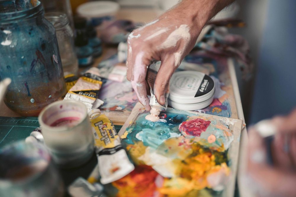
Textural Play with Vibrant Paints Using Mixed Media Approaches
Texture gives flat color fields haptic sensations that interact with touch as well as sight, especially when using quality acrylic paint sets. Adding modeling paste to pigments produces sculptural ridges with varying light-catching ability over a rainbow spectrum. Using gritty sand or microbeads in heavy body paints creates surfaces that, when painted in strong colors, shimmer gently. While brushes provide flowing streaks that contrast strongly, palette knife strokes lay rich, vivid ribbons. To produce granulation effects emphasizing paper fibers, watercolor painters mix colors onto wet, textured paper. For shimmering transparency near matte forms, mixed media paintings use acrylic inks with colored gels. Under strong chromatic layers, embedding fabric or broken paper pieces adds pattern and depth. These textural combinations create abstractions and dynamic scenes where color interacts with the form itself, therefore inspiring viewers to find hidden shapes and surprises.
Incorporating Metallic and Iridescent Pigments for Dynamic Highlights
Reflecting light and changing color as viewers wander about the artwork, metallic and iridescent paints give a sensation of movement. To get shiny highlights that contrast with matte backgrounds, artists use pearlized powders in acrylic or oil paintings. While interference colors change pure colors into chameleon-like variations between blue and purple, gold and copper flakes capture light differently than silver. Mica-based suspensions applied through glazing layers accentuate the depth and highlight the impression of floating over underlying tones. Strategic arrangement of metallic elements highlights edges or silhouettes, hence stressing focus areas. From glistening cityscapes to delicate flower studies, these dazzling embellishments perform miracles in abstract or representational paintings. Layering iridescent washes over deep colors creates a brilliant undercurrent that transforms a still painting into a live light display, changing with every view.
Crafting Mood and Atmosphere Through Gradient Transitions and Blends
From cold cerulean dawns to brilliant orange sunsets on a single canvas, smooth gradient transitions direct emotional tone. By removing strong borders, layering wet-on-wet mixes lets nearby colors naturally combine, creating dreamy abstractions or foggy vistas. Artists soften edges with soft brushes or blending tools, thereby regulating the way colors mix at junctures. Subtle banding effects with varying pressure and brush angles provide both consistent fades and startling changes. At transition points, adding a bit of complimentary color increases brightness and helps to prevent muddy neutrals. Without depending on defined shapes, that subtle gradient work creates a mood that invites viewers to experience rather than just see. While traditionalists use sponges or tattered towels for textured fades, digital artists copy analog blends using gradient meshes and layer masks. Gradients create emotional landscapes in motion when steady control meets spontaneous mixing.
Conclusion
Painting escapades are much more exciting when we go into realms beyond simple brushes and flat canvases. Methods that layer, gloss, and change surfaces give color dreams life. Strong contrasts, smooth blends, and tactile textures inspire limitless discovery and transform every work into a rich trip. Using these techniques helps works to be more radiant, resound deeper, and really leave vivid marks on every canvas.