Think about the last time you visited a website and left within seconds. Maybe it took too long to load. Maybe you could not figure out where to click. Maybe it just looked like it was built in 2009 and never touched again. You did not think twice about leaving. You just left.
That is the reality businesses face every single day. A website is often the first impression a potential customer gets. And if that impression is bad, they are gone. No second chances, no explanation needed.
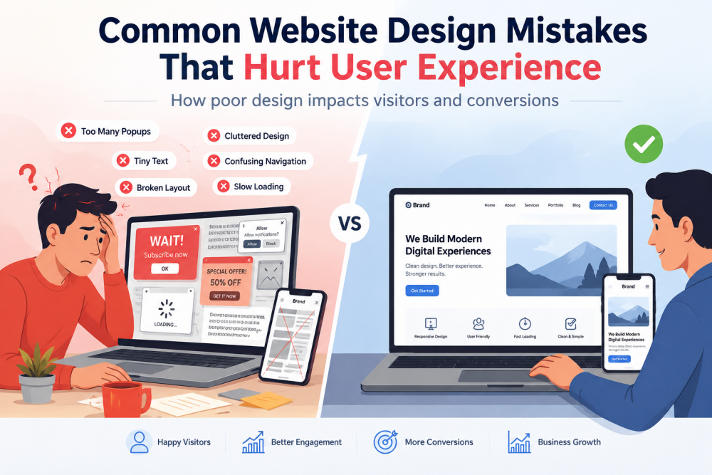
The frustrating part is that most of these problems are avoidable. Businesses are not losing customers because of bad products or poor service. They are losing them because of design mistakes that nobody stopped to fix.
Slow loading speed is a silent killer
Most people will not wait more than three seconds for a page to load. That is not an opinion. That is just how people behave online now. Attention is short, and alternatives are one tap away.
A slow website does more damage than most business owners realise. It frustrates visitors, yes. But it also hurts your rankings on Google. Search engines factor in page speed when deciding where your website appears in results. So a slow site is essentially being punished twice, once by the visitor who leaves, and once by the algorithm that buries it.
Heavy images that were never compressed, outdated hosting, too many plugins running in the background, these are the usual suspects. They are also completely fixable with the right attention.
No one can find what they are looking for
Navigation should never make someone think. When a visitor lands on your website, they should immediately understand where they are, what you offer, and where to go next. If they have to guess, you have already lost them.
This happens more often than it should. Businesses get creative with their menu labels. They bury their contact page. They hide their pricing behind three clicks. All in the name of looking different or unique.
Clarity always beats cleverness. A visitor who cannot find what they need in the first few seconds will not stick around to figure it out. They will find a competitor whose website actually makes sense.
The website breaks on mobile
More than half of all website traffic today comes from mobile devices. People are browsing on their phones while commuting, during lunch breaks, and late at night before they sleep. If your website is not built for mobile, you are essentially turning away more than half of your potential visitors.
A broken mobile experience is not always dramatic. Sometimes it is subtle. Text that is too small to read without zooming in. Buttons that are placed too close together. Images that overflow the screen. Forms that are impossible to fill out on a small keyboard. Each of these small issues adds friction. Enough friction and the visitor leaves.
Businesses operating in competitive markets understand this well. Any reputable web design agency in Dubai, UAE, will tell you that mobile-first design is no longer a premium add-on. It is the baseline expectation.
Too much is going on at once
There is a version of bad design that comes from neglect. And then there is a version that comes from trying too hard.
Some websites are overwhelming. Multiple pop-ups fighting for your attention. Autoplay videos. Bright colors competing in every section. Five different fonts. A homepage that tries to say everything and ends up saying nothing clearly.
Visitors do not need to be impressed by how much is on the page. They need to be guided. Good design is quiet. It holds attention without shouting for it. Every element should have a purpose. If it does not earn its place, it should not be there.
No clear next step for the visitor
You can have a beautiful website. Fast, clean, easy to navigate. And still lose customers because you never told them what to do next.
Every page needs a clear call to action. Book a call. Get a quote. Download this guide. Send us a message. Something that tells the visitor where to go once they have read what you have to say.
Without it, visitors read your content, feel vaguely interested, and then close the tab. Not because they were not convinced. Simply because nobody asked them to take the next step.
Building trust is being ignored
People are careful online. Before they hand over their money or their contact details, they want to feel confident that they are dealing with someone legitimate.
A website that has no testimonials, no client logos, no team photos, and no visible contact information feels anonymous. And anonymous does not convert.
Real reviews from real customers matter more than perfectly written copy. A phone number in the header matters. A physical address matters. These small signals tell visitors that there is an actual business behind the website. That somebody is accountable. That they are not about to be ignored.
The real cost of getting this wrong
Website design mistakes do not announce themselves loudly. They just quietly cost you customers, month after month, without you always knowing why.
The good news is that most of these issues are not complicated to fix. They just require someone to actually look at the website from the visitor’s perspective and be honest about what is not working.
Businesses that take this seriously, whether they work with an experienced web design agency in Dubai, UAE or invest in an internal team, are not doing it to win design awards. They are doing it because a website that works properly is one of the most reliable ways to grow.
Everything else in your business can be excellent. But if the website is letting people down, a lot of that effort goes to waste.