When I pick up a book, the cover usually speaks first. It gives me a quick feeling about the story, the subject, and the quality of the book. Therefore, a strong cover can make a reader stop, look closer, and feel interested.
For authors in Canada, a cover can also help a book stand out in a busy market. Many readers see books online first, so the design must work well as a small image too. That is why many writers look for book cover design services when they want a polished and clear first impression.
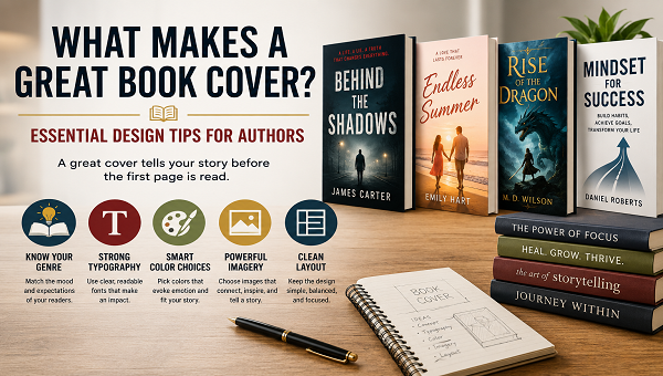
Also, I believe a book cover should do more than look pretty. It should explain the genre, attract the right reader, and match the tone of the book. So, in this guide, I will share practical author book cover design tips that can help writers make better design choices.
Why a Book Cover Matters So Much
A book cover is like a promise to the reader. It gives a quick idea of what is inside. For example, a romance cover should feel different from a thriller cover. Likewise, a business book should feel different from a children’s story.
However, many authors focus only on the writing and treat the cover as a final detail. I understand that because the manuscript takes a lot of work. Still, the cover is often the first thing readers see.
Therefore, a weak cover can hurt a good book. If the design feels confusing, readers may scroll past it. On the other hand, a clear and attractive cover can invite them to read the title, check the description, and consider buying.
So, I always see cover design as part of the book’s marketing. It helps the book compete, especially when readers compare many choices at once.
Start With the Right Genre Feeling
The first design step is understanding the genre. A book cover should quickly tell readers what type of book they are looking at. This does not mean every cover must look the same. However, it should follow enough genre signals to feel familiar.
For example, a mystery book may use dark colors, shadow, bold text, or a tense image. Meanwhile, a self-help book may use clean space, calm colors, and simple typography. A fantasy book may use rich artwork, magical elements, or dramatic lighting.
Also, readers often make fast choices. They may not study the cover for long. Therefore, I want the genre to be clear in a few seconds.
This is one of the most useful author book cover design tips because it helps avoid confusion. If a cover looks like romance but the book is horror, the wrong readers may click. Then, the right readers may never notice it.
Make the Title Easy to Read
A beautiful cover still fails if the title is hard to read. The title is one of the most important parts of the design. Therefore, I always check if it is clear from a distance and as a small image.
Simple fonts often work best. However, simple does not mean boring. A strong font can show mood, style, and genre without making the cover messy.
Also, the title should have enough contrast from the background. If the background is busy, the text may need a solid shape, shadow, or cleaner space behind it. This helps the words stand out.
I also avoid using too many fonts. Usually, two fonts are enough. One can be used for the title, and the other can be used for the subtitle or author name. As a result, the cover feels more balanced.
Choose Colors With Purpose
Color creates emotion quickly. Therefore, I never choose colors only because they look nice. I choose colors that match the book’s message and mood.
For example, blue can feel calm, trusted, or serious. Red can feel bold, urgent, or emotional. Black can feel powerful, dramatic, or mysterious. Meanwhile, soft colors can feel gentle, romantic, or peaceful.
However, too many colors can make a cover look crowded. So, I usually prefer a clear color palette with two or three main colors. This keeps the design clean and easier to understand.
Also, color should support the title. If the background and text are too close in tone, the words can disappear. Therefore, contrast matters a lot.
In Canada, where many authors publish both print and digital books, color must also work across different formats. A color may look bright on screen but darker in print. So, testing the design matters.
Use Images That Match the Story
Images can create interest fast. However, the image should support the book, not confuse the reader. A random image may look good, but it can weaken the message.
For fiction, the image may show a character, a setting, an object, or a mood. For nonfiction, it may show a symbol, a clean graphic, or a visual idea. Either way, the image should connect with the book’s core promise.
Also, I try not to show too much. Sometimes, one strong image works better than many small details. A simple object, a clear scene, or a bold symbol can be easier to remember.
If the cover uses a person, the style should match the story. For example, a soft portrait may fit romance. A hidden face may fit mystery. A strong pose may fit action or fantasy.
Therefore, image choice should never be random. It should help readers understand the book faster.
Keep the Layout Clean and Balanced
A strong layout guides the reader’s eye. It tells them what to look at first, second, and third. Usually, the title should be one of the first things they notice.
A clean layout does not mean empty. It means every part has a clear job. The title, subtitle, author name, image, and background should all work together.
Also, spacing matters. If everything sits too close together, the cover feels crowded. If everything is too far apart, the design may feel weak. So, balance is important.
This is where a trained designer can make a big difference. If I want a cover that looks polished and market-ready, working with the best book cover designer can help with layout, style, typography, and overall visual direction.
Still, authors should understand the basics too. When I know what makes a cover strong, I can give better feedback and avoid design mistakes.
Think About the Thumbnail View
Many readers first see a book cover online. They may see it on a phone, tablet, store page, social media post, or ad. Therefore, the cover must look good when it is small.
This is called the thumbnail test. I like to shrink the cover and check if the title still reads well. I also check if the main image still makes sense.
If the cover looks messy as a thumbnail, readers may skip it. This can happen even when the full-size design looks good. So, a cover must work in both sizes.
Also, small text can be a problem. A subtitle may look fine on a printed book, but it may vanish online. Therefore, I keep the most important words large and clear.
This is one of the most practical author book cover design tips for modern publishing. Since so many book sales begin online, thumbnail clarity is not optional.
Match the Cover to the Reader
A great cover is not only about the author’s personal taste. It should also match the reader’s expectations. Therefore, I always ask who the book is for.
For example, a young adult fantasy reader may expect bold imagery and a strong mood. A business reader may expect a clean, smart, and trusted look. A poetry reader may respond to softer design and emotional space.
Also, the cover should match the problem or desire of the reader. If the book teaches money skills, the cover should feel helpful and credible. If the book tells a love story, the cover should create emotion.
Therefore, I do not design only for myself. I design for the person most likely to buy and enjoy the book.
This approach makes the cover more useful because it connects design with reader behavior.
Avoid Too Many Design Elements
Many new authors want to add everything to the cover. They may want several images, a long subtitle, extra symbols, many colors, and multiple font styles. However, too much detail can make the cover weaker.
A cover should not explain the whole book. Instead, it should create interest. It should give enough information to attract readers without making the design heavy.
So, I try to focus on one strong idea. The cover may show a main symbol, a strong title style, or a clear mood. Then, the rest of the design supports that idea.
Also, simple covers often look more professional. They can feel more confident because they do not try too hard.
Therefore, when in doubt, I remove extra details. A cleaner design usually feels stronger and easier to remember.
Make the Author Name Clear
The author name also matters, especially for building a long-term writing brand. Even if the author is new, the name should look clean and professional.
The author name does not always need to be as large as the title. However, it should still be easy to read. If the author already has a known audience, the name may need more visual weight.
Also, the font should match the rest of the cover. A playful font may not fit a serious nonfiction book. A sharp thriller font may not fit a soft romance novel.
Therefore, I treat the author name as part of the full design. It should feel connected, balanced, and clear.
Over time, a consistent author style can help readers recognize new books faster.
Use the Back Cover and Spine Wisely
The front cover gets most of the attention, but the back cover and spine also matter for printed books. The spine is important because it may be the only part readers see on a shelf.
The spine should include the title and author name clearly. Also, the colors and fonts should match the front cover. This creates a complete and professional look.
The back cover should support the reader’s decision. It can include a strong book description, author bio, barcode area, and review quotes if available. However, it should not feel crowded.
Also, the back cover should use the same design style as the front. This makes the whole book feel planned.
For authors in Canada who sell books at events, bookstores, or local signings, a strong full cover can make the book feel more trustworthy.
Check Print Quality and File Setup
A great design also needs correct file setup. If the file is not prepared properly, the printed book may not look right. Colors may shift, edges may cut off, or text may sit too close to the trim line.
Therefore, I always check bleed, margins, spine size, and image quality. High-resolution images are important because blurry covers look unprofessional.
Also, print and ebook covers may need different formats. An ebook cover is usually a front image only. A print cover includes the front, back, and spine in one full file.
So, the design process should include technical checks. This helps avoid delays and printing problems.
A professional cover is not just about art. It also needs the right setup for publishing platforms and printers.
Test the Cover With Fresh Eyes
After looking at a cover for a long time, I may stop seeing problems. Therefore, I like getting feedback from a few people who understand the target reader.
However, I do not ask everyone. Too many opinions can make the design confusing. Instead, I ask people who fit the book’s audience or understand the genre.
I ask simple questions. What type of book do you think this is? Can you read the title quickly? What feeling does the cover give you? Would you click it online?
These answers can reveal problems fast. If people misunderstand the genre, the cover may need changes. If they cannot read the title, the typography may need work.
Therefore, testing helps make the final design stronger.
Common Book Cover Mistakes to Avoid
Even a good idea can fail if the design has common problems. So, I watch for these mistakes:
- Using too many fonts
- Choosing weak color contrast
- Making the title too small
- Adding too many images
- Ignoring the genre
- Using low-quality photos
- Forgetting the thumbnail test
- Making the cover too personal instead of reader-focused
Also, I avoid copying another cover too closely. Inspiration is fine, but the design should still feel original. A book needs its own identity.
When I follow these author book cover design tips, I can make better choices and avoid common design problems.
Key Takeaways
- A great book cover should show the genre clearly, so the right readers understand it fast.
- Strong typography, color, layout, and imagery can make a cover look professional and memorable.
- The best cover design should look good in print and as a small online thumbnail.
Final Thoughts
A great book cover should be clear, attractive, and connected to the book’s message. It should help the right readers understand the genre, mood, and value of the book quickly. Also, it should look professional in print and online.
As an author, I do not see the cover as decoration. I see it as a key part of the book’s success. A strong cover can help readers feel curious, confident, and ready to learn more.
For writers in Canada, a polished design can help a book stand out in a growing market. Therefore, the best cover should balance creativity with smart design choices.
In the end, a great book cover does not need to show everything. It only needs to say the right thing clearly. When the title, image, color, typography, and layout work together, the cover can make a powerful first impression.