Web design companies like Esspesoft offer responsive web design as a part of their services. The meaning of responsive web design is a website that works smoothly on all devices, like movies, laptops, desktops, and tablets.
Before phones and tablets, it was not necessary to include a responsive web design in business websites. Now it is way too important for any business to have a responsive website, as it shows that you care about your customer’s needs.
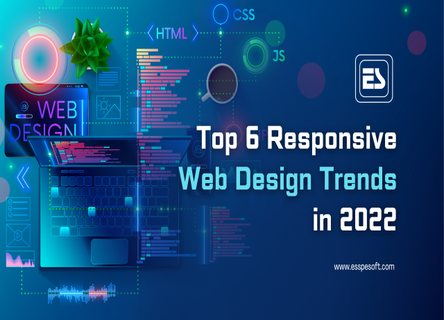
In this blog, Esspesoft will discuss the 6 responsive website trends. To know more, keep reading.
6 Trends of Responsive Web Design Company in Kolkata salt lake sector 5
Here are the trends that a business needs on their business responsive websites.
Media queries -Media queries allow developers to make use of the condition checks in order to alter web designs that are based on the properties of the user’s device. This simply defines breakpoints in the HTML/CSS, as it’s a more smooth experience for the user.
Fluid grids – When flexible grids are built using CSS, the columns, therefore, rearrange themselves in order to fit the size of the screen or the browser window. whether the screen is a 21-inch desktop computer, a 13-inch laptop, a 9.7-inch tablet, or a 5.5-inch cell phone.
Read More: Top Reasons Why Your App Needs an Efficient Ul/UX Design
Flexible visuals- the three technical ingredients for a responsive web design are Fluid grids, flexible images, and media queries. Apart from these t also needs a different way of thinking. Something than quarantining our content into disparate, device-specific experiences.
Card-Based Design-A card-based design is pieces of information that are organized into “cards” in a visual way, also with a distinctive image or block of text. A card-based design is important for responsiveweb design because it rearranges its structure according to the user’s screen size.
Hidden menus-Hidden menus are minimal home pages that became more popular while looking at a trend in which users must click a menu icon of three parallel lines at the right or left top of the screen to reveal the website’s navigation options.
Single-long-scrolling-page- sites that have all their content on one page still have a navigation bar at the top of the screen, but the difference is when these options are clicked. After clicking the user is taken to a location that is already on the page(instead of a completely new webpage).
Conclusion
There you go with the top 6 trends of responsive web design. Knowing all these trends can be interesting but applying them is not that easy. The web design company in Kolkata can guide your business more on responsive web design.