Professional employees or public-facing organizations, like banks, universities, etc., prefer printed name badges over uniforms to identify themselves. They either hang it around their neck via a lanyard or on their clothing through a sturdy clip to distinguish themselves among the clients. It streamlines communication and business operations, thus boosting productivity, efficiency, and profits.
However, their design is a significant concern, as any mistake within it can create hurdles and leave a bad impression. To help you in this case, we present you with a brief yet helpful guide to designing the perfect printed name badge.
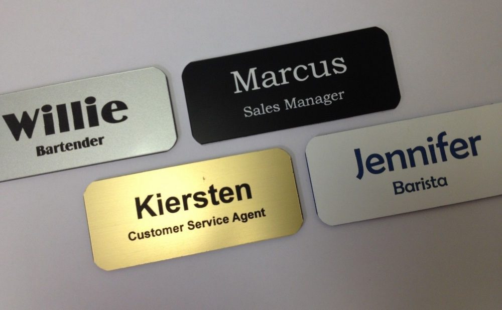
How To Design The Best Printed Name Badges: Top 12 Tips
- Size Matters In Bagde-Making
Maintaining a balance when it comes to the size of a name badge is important. For instance, choosing a large size would appear like you have a billboard over yourself. On the other hand, a tiny one would require other people to squint their eyes to read text over your motif.
You should always first think about the placement of your area, such as around the neck or pinned to a shirt. While keeping that in mind, choose an appropriate size. Make sure the one you pick is easily readable without being overwhelming.
- Opt Standard Font
The next thing that impacts readability is the font you choose for your name badge. Avoid fancy or decorative ones as they are not easy to read from a distance, especially when they appear in a crowded space. Instead, stick to simple and effortlessly readable fonts, like Arial, Helvetica, or Times New Roman, Thus, they’re a safe choice.
- Go For Big And Bold Typography
Once you have chosen your font, choose a bigger and bold style for them to make them stand out. It would not only enhance the appeal of your motif but also make them visible, even from a distance. Select a slightly different font-weight and hue for your name to make it distinguishable from the rest of the badge. Considering this subtle change would improve readability and draw attention towards the most significant information.
- Coordinate Colors
Maintaining a colour contrast is a tough but worthwhile job to create a professional and visually appealing design. Go for high-contrast hues, such as black text on a white background or blue on a red colour. It will make the text on your printed name badges visible. Reflect on your brand or organization’s hues and reflect them onto your patch design.
While you may get the temptation to compromise readability for aesthetics, you should avoid such a mistake. Always remember that your primary goal while designing is to make your names easily readable at first glance.
- Pay Attention To The Background
Pay attention to the background of your name badge rather than only the main part. Keep it simple and uncluttered. Avoid any busy or overly complex designs for the back that can distract the spectator from focusing on the text. Pick a solid tone or subtle patterns that would provide a clean backdrop for your typography.
- Showcase Your Company’s Logo
Showcase your company’s logo on the design to embrace a professional touch and boost brand identity. The ideal placement area is the corner, along with the bottom of your badge, to keep it small and unobtrusive. This tip would ensure the logo doesn’t overshadow the primary purpose of your motif, which is to display your attendee’s name.
- Sprinkle QR Code Magic
While taking the innovative approach, you can include a QR code to your patch. It is a convenient way to share your additional information with people you meet and let them easily connect with you. It is a modern alternative to the exchange of business cards or manual typing in URLs. You can include a link to your LinkedIn profile, your personal website, or an online portfolio. Choose a size for your QR code that is scannable within seconds and test it out before printing to ensure it works correctly.
- Lamination For A Finishing Touch
Lamination on your patch has two purposes: it offers a finishing touch and protects from any possible damage. Any spill, tears, or smudges will no longer ruin the appeal of an emblem if it has a lamination layer. The emblem would look polished and clean throughout the event or even longer duration. Plus, it also offers a glossy sheen appeal to the design, thus making it stand out.
- Double-Sided Option To Incorporate Details
If you have to include too much information, integrating it all on the front side of your patch would create a messy design. This is where you should resort to double-sided print to integrate all information without cluttering it. For instance, you can include your employee’s name and job title on the front while the company’s name, logo, and contact information are on the back. This way, spectators would easily avail the important information and don’t have to ask for clarification.
- Accessorize Wisely
You may have to accessorize your emblem to make it wearable. Whatever you attach to it will greatly impact its look and feel while wearing it. A sturdy clip or lanyard is the right choice, as it securely holds personalised name Badges in place and doesn’t cause any damage. However, we suggest you opt for a lanyard if you move a lot during the event or work and shake hands frequently.
As the motif would hang around your neck, it wouldn’t get lost and would be visible at all times. Alternatively, a small and robust clip that would attach the piece to your attire also works well. Choose accessories according to your comfort level and how much you would move during your work timings.
- Run A Test
Suppose you chose a design accidentally, and you ignored a stupid mistake and approved it without testing. Now, your entire quantity doesn’t look up to mark due to that blunder, and it fails to make a solid impression. It was just an imaginary scenario, but it can become true if you don’t run a test before getting your product in a bulk quantity.
Always try out a sample once you choose a design and pay attention to how it looks or feels realistically. All details, such as font size, spacing, and alignment, should complement each other. Also, there should be no room for even a slight error before printing the final batch.
- Seek Feedback And Valuable Insights
At times, you may think that the design looks fabulous, but it appears average in reality. Therefore, seek feedback from your friends, colleagues, trusted mentors, or professional badge designers. They will offer you honest opinions, suggestions for improvements, and valuable insights to enhance your design’s professionalism. Stay positive, keep your mind open to feedback, and willingly make changes according to their feedback.
Summing Up
These are all the factors you should consider while designing the perfect printed name badge. It will let you maintain a contrast between all elements, including typography, font, colour scheme, size, and accessories. Consequently, you will create a design that leaves a positive impression and will make your name memorable to everyone you meet.