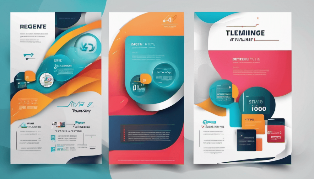
Creating a visually appealing poster involves various elements, and one crucial aspect that often gets overlooked is choosing the right fonts. The fonts you select play a pivotal role in conveying your message effectively and capturing your audience’s attention. In this comprehensive guide, we will delve into the intricacies of selecting fonts for your posters and make a poster to ensure maximum impact.
The Importance of Font Selection
1. Establishing Brand Identity
Your choice of fonts contributes significantly to building and reinforcing your brand identity. Consistency in font usage across your posters helps in creating a recognizable and cohesive brand image.
2. Enhancing Readability
One of the primary functions of a poster is to convey information. The right fonts enhance readability, ensuring that your audience can easily grasp the message you are trying to communicate.
3. Evoking Emotion
Fonts have the power to evoke emotions and set the tone for your message. Whether you want to convey a sense of urgency, playfulness, or sophistication, the right font can help you achieve the desired emotional impact.
Factors to Consider When Choosing Fonts
1. Poster Purpose and Audience
Before selecting fonts, consider the purpose of your poster and your target audience. For formal or professional messages, opt for clean and classic fonts, while creative or youth-oriented posters can experiment with more playful options.
2. Font Legibility
Legibility is paramount. Avoid overly ornate or complex fonts that may hinder readability. Opt for clear and straightforward fonts, especially if your poster will be viewed from a distance.
3. Font Pairing
Experiment with font pairing to create visual interest. Combining a bold headline font with a complementary, easy-to-read body font can enhance the overall aesthetic appeal of your poster.
Best Fonts for Different Poster Types
1. Corporate Events
For corporate events, choose fonts that exude professionalism and sophistication. Classic serif fonts like Garamond or modern sans-serif fonts like Helvetica can be excellent choices.
2. Music or Art Events
For more creative and expressive events, consider unique and eye-catching fonts like Bebas Neue or Playfair Display. These fonts add a touch of flair and personality to your poster.
Making Your Poster Stand Out
1. Play with Typography Hierarchy
Establish a clear hierarchy in your poster’s typography. Use larger and bolder fonts for headlines and essential information, creating a visual hierarchy that guides the viewer through the content.
2. Use Color to Emphasize
Combine font color with your overall design to emphasize key points. Contrast between the background and font color enhances readability and draws attention to crucial information.
The Role of Typography in Poster Design
1. Building Visual Hierarchy
Typography creates a visual hierarchy that guides the viewer’s eyes through the poster. Use font size, weight, and style strategically to prioritize information.
2. Aligning with Design Elements
Harmonize your font choices with other design elements such as images and graphics. Ensure that fonts complement rather than compete with the overall design.
Incorporating Modern Trends in Font Design
1. Minimalist Typography
In recent years, minimalist typography has gained popularity. Clean lines and ample white space create a modern and sophisticated look, making your poster stand out.
2. Custom Fonts for Brand Originality
Consider creating or commissioning custom fonts for your brand. This not only adds a unique touch but also ensures brand originality and recognition.
Conclusion
In conclusion, the fonts you choose for your posters significantly impact how your message is perceived. From establishing brand identity to enhancing readability and evoking emotions, thoughtful font selection is a key aspect of effective poster design. Consider the purpose of your poster, your target audience, and the visual hierarchy you want to establish. Experiment with different fonts, but always prioritize legibility and coherence.


